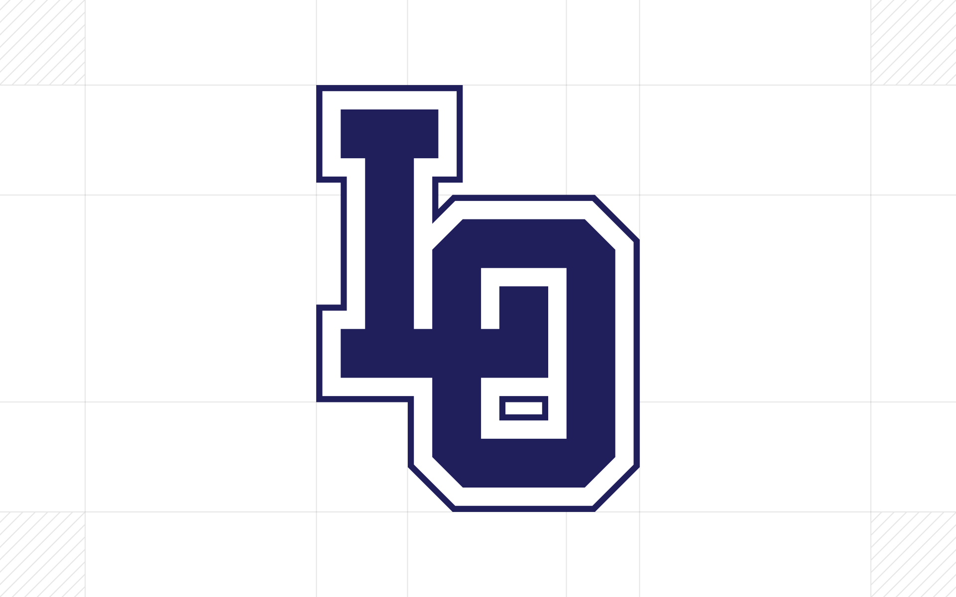

I redesigned the logo of Lake Oswego High School to fix the many alignment problems of the original. The misaligned logo has been used on merch, banners, the website, the giant 3D light-up sign on the third floor, and even the football field — although the football field has a different version that is equally misaligned.
Before
After
The new logo was designed on a 52 × 70 pixel grid so that every element aligns perfectly. All strokes are a consistent 8 pixels wide. The white outline is 3 pixels wide, and the outer blue stroke is 1 pixel. The result is a mark that feels intentional at every scale — from a favicon to a football field.